Improving Dedicated Node Marketplace & Conversion for Blockdaemon
Blockdaemon is the leading blockchain infrastructure platform, powering web3 services for some of the world’s largest financial institutions.
With Blockdaemon’s on chain solutions, clients are able to read and write to the blockchain with a reliable network connection via Dedicated Nodes.
The Problem:
Although Blockdaemon offers dedicated nodes for over 40+ protocols (aka networks), poor searchability made many of them undiscoverable. In addition, poor layout choices made scanning the marketplace page cumbersome. Lastly, research uncovered a steep dropoff in conversion on the checkout page.
The goals:
Increase network checkout page views by 20%
Increase conversion rates by 10%
Project Overview:
Team:
Lead Product Designer (me), 1x peer Product Designer, 1 Head of Product, 4 engineers
The Process:
First, I identified why the existing network list page is so difficult to discover new networks:
There’s over 40 networks listed in alphabetical order with no indication as to how many are in the list. It feels like it scrolls on forever.
The search bar only identifies full names, not ticker names, leading to many “not found” responses.
Networks with the “Assisted Deploy” tag on them received even lower page views - indicating that the tag would detract users from exploring the network page at all.
The Ubiquity API banner & labels - this was initially intended to be a cross-selling initiative to get users to consider using another product instead. It never improved conversion and it just adds clutter.
I used wireframes to decide what content should be included for each network.
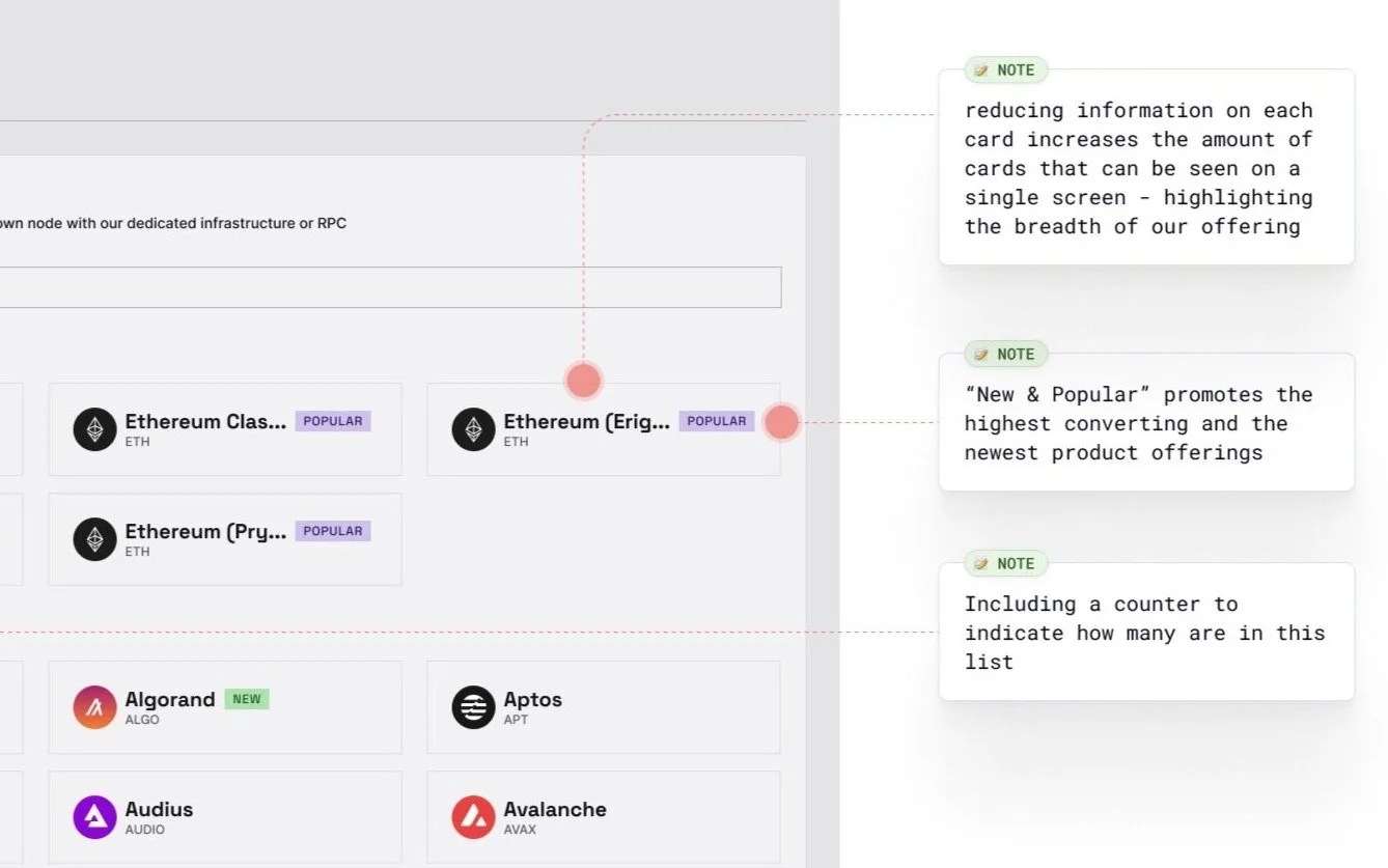
It’s important to note that Blockdaemon’s competitive advantage is the number of networks it offers (over 40+). I realized that the original design failed to highlight this strength by only showing <10 networks in a single page view.
By increasing the content density, and adding a section for ‘New & Popular’ - I was able to accomplish 2 major goals:
Increase the number of networks visible to emphasize the breadth of Blockdaemon’s product offerings.
Increase page views on all products in the highlighted section.
Improving Searchability
BEFORE
AFTER
I advocated to improve the search bar functionality by including tickers for search matches. The majority of users on this page are web3 native and use the ticker names just as frequently as the full names.
By not matching tickers, Blockdaemon was missing out on significant, recurring revenue from users believing we didn’t offer the network they were in search of.
Checkout Page Improvements
I made it easier to checkout by reducing the number of clicks from 8 to as few as 2 . How?
I prioritized the required fields so that users would interact with those first. Of the required fields (Network, Node Type), I realized there there would never be more than 5 options. So I opted to display all options as radio buttons instead of hiding them behind dropdowns, removing 4 clicks.
I also realized that Server Details are dependent upon the user’s selections in the first two sections, and that a majority of users can’t select an option anyway. To remove visual clutter, I kept the dropdowns because it’s the most effective way to list hundreds of available options.
Before
After
Results:
40% increase in page visits for networks, mostly driven by the New & Popular section
12% increase in conversion


